
Case study — Brand identity
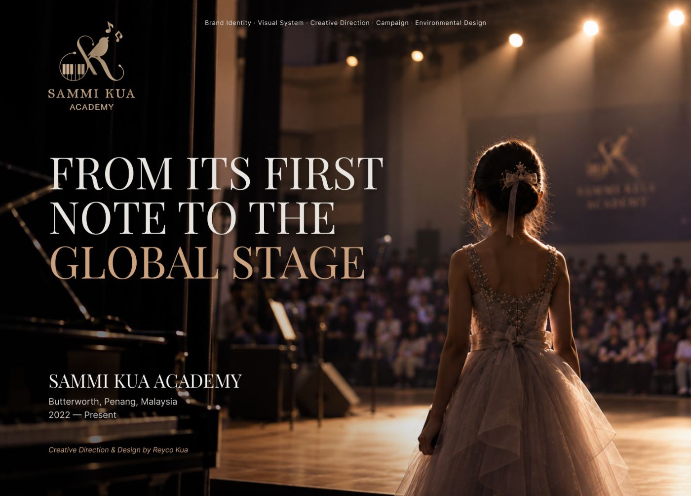
Designing the rise of a performance brand, from zero to international stage
Four years building the first visual language for a performing arts academy — logo, colour system, campaigns and stage branding that carried its students onto stages across Hong Kong, Malaysia and China.
01 — The beginning
Before there was a brand.
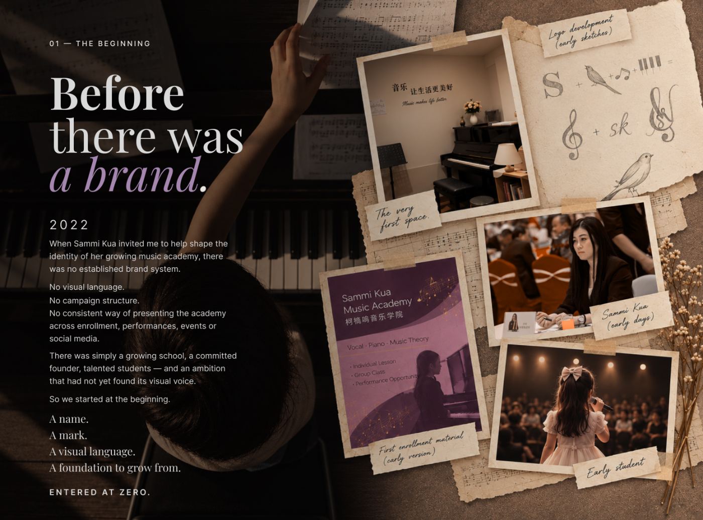
2022. When Sammi Kua invited me to help shape the identity of her growing music academy, there was no established brand system.
No visual language. No campaign structure. No consistent way of presenting the academy across enrollment, performances, events or social media.
There was simply a growing school, a committed founder, talented students — and an ambition that had not yet found its visual voice.
So we started at the beginning. A name. A mark. A visual language. A foundation to grow from.
Entered at zero.
02 — The creative partnership
Built from the ground up. Grown over time.
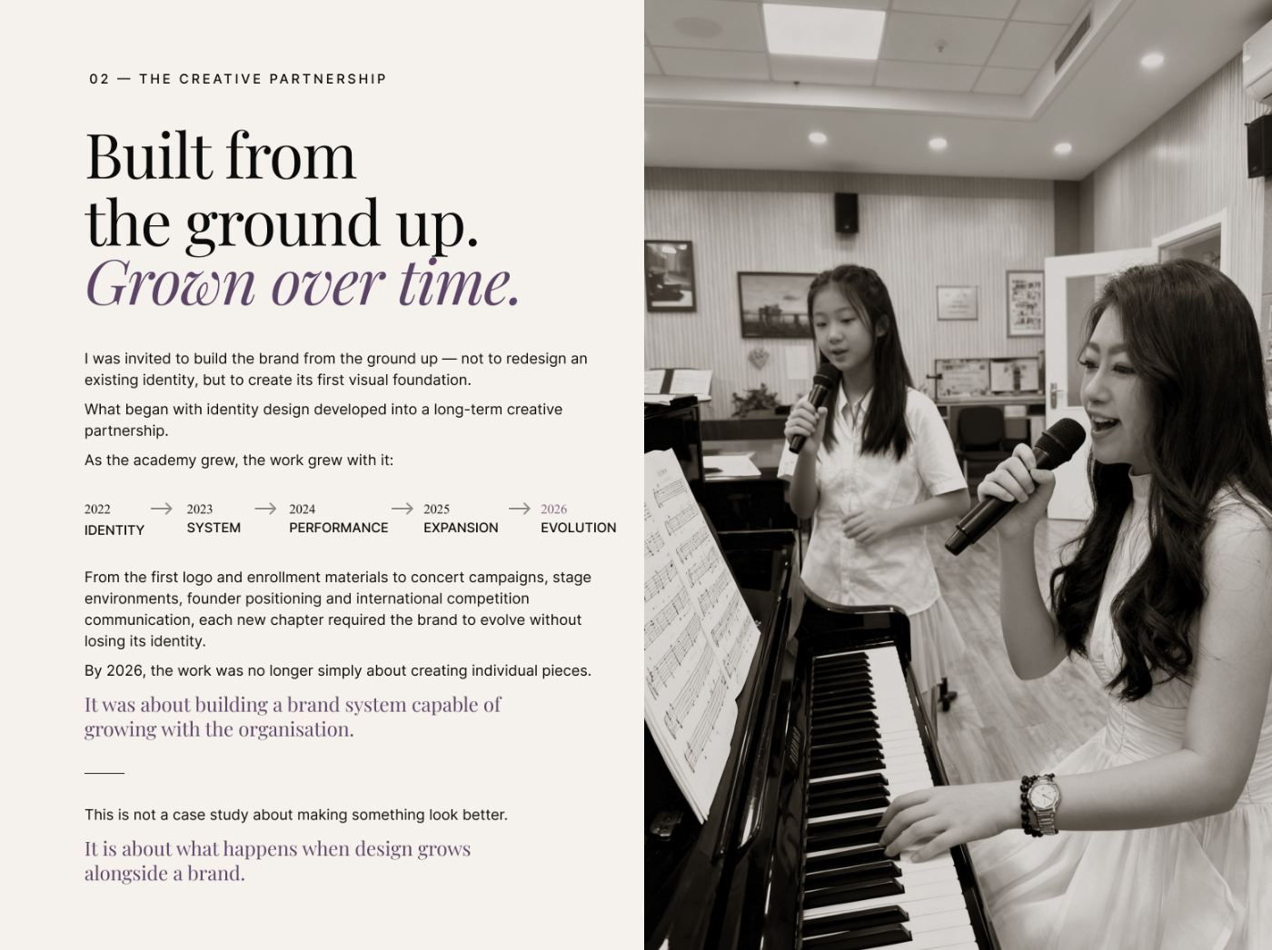
I was invited to build the brand from the ground up — not to redesign an existing identity, but to create its first visual foundation.
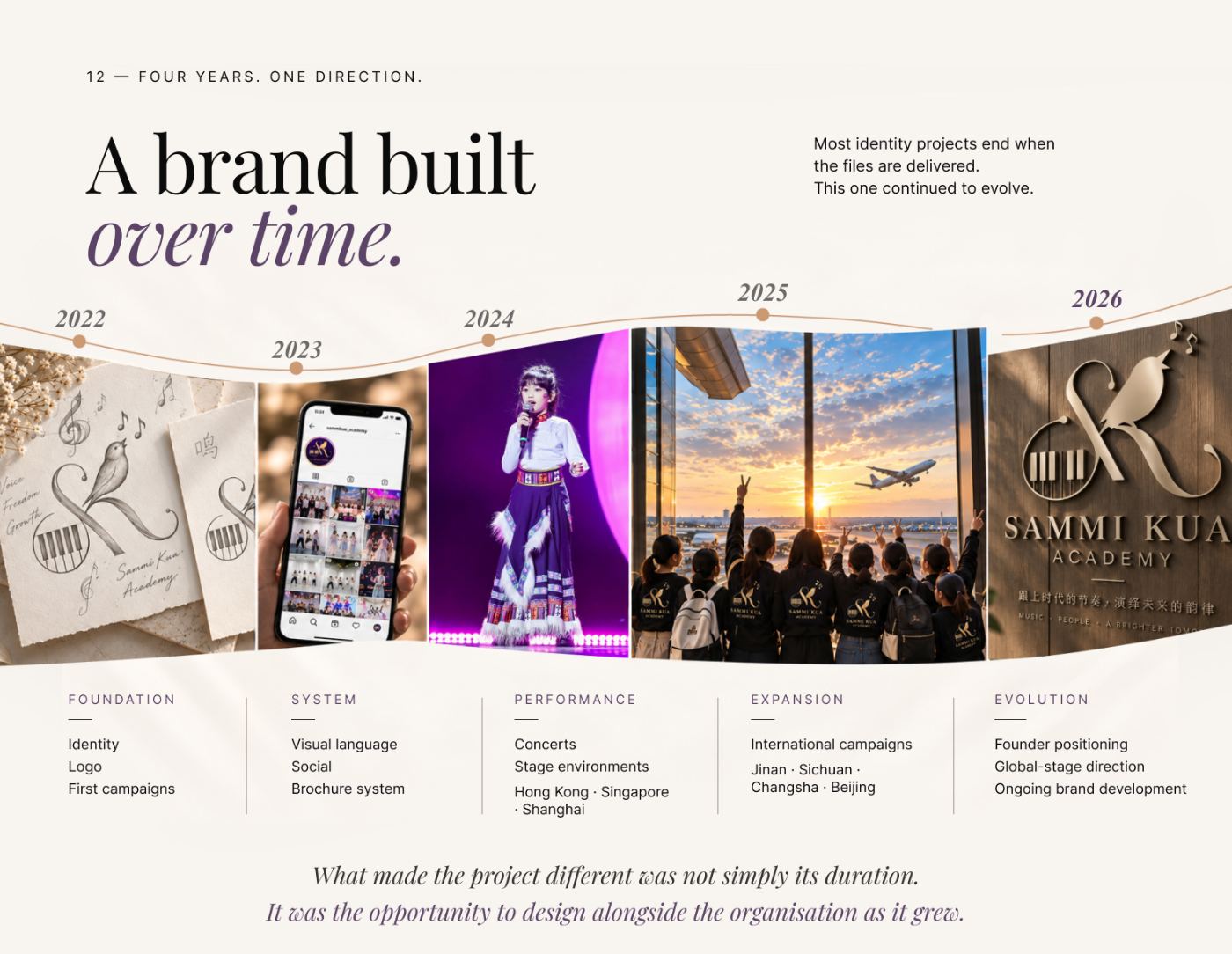
What began with identity design developed into a long-term creative partnership. As the academy grew, the work grew with it: 2022 identity, 2023 system, 2024 performance, 2025 expansion, 2026 evolution.
From the first logo and enrollment materials to concert campaigns, stage environments, founder positioning and international competition communication, each new chapter required the brand to evolve without losing its identity.
By 2026, the work was no longer simply about creating individual pieces. It was about building a brand system capable of growing with the organisation.
This is not a case study about making something look better. It is about what happens when design grows alongside a brand.
03 — The challenge
Strong teaching. Invisible brand.
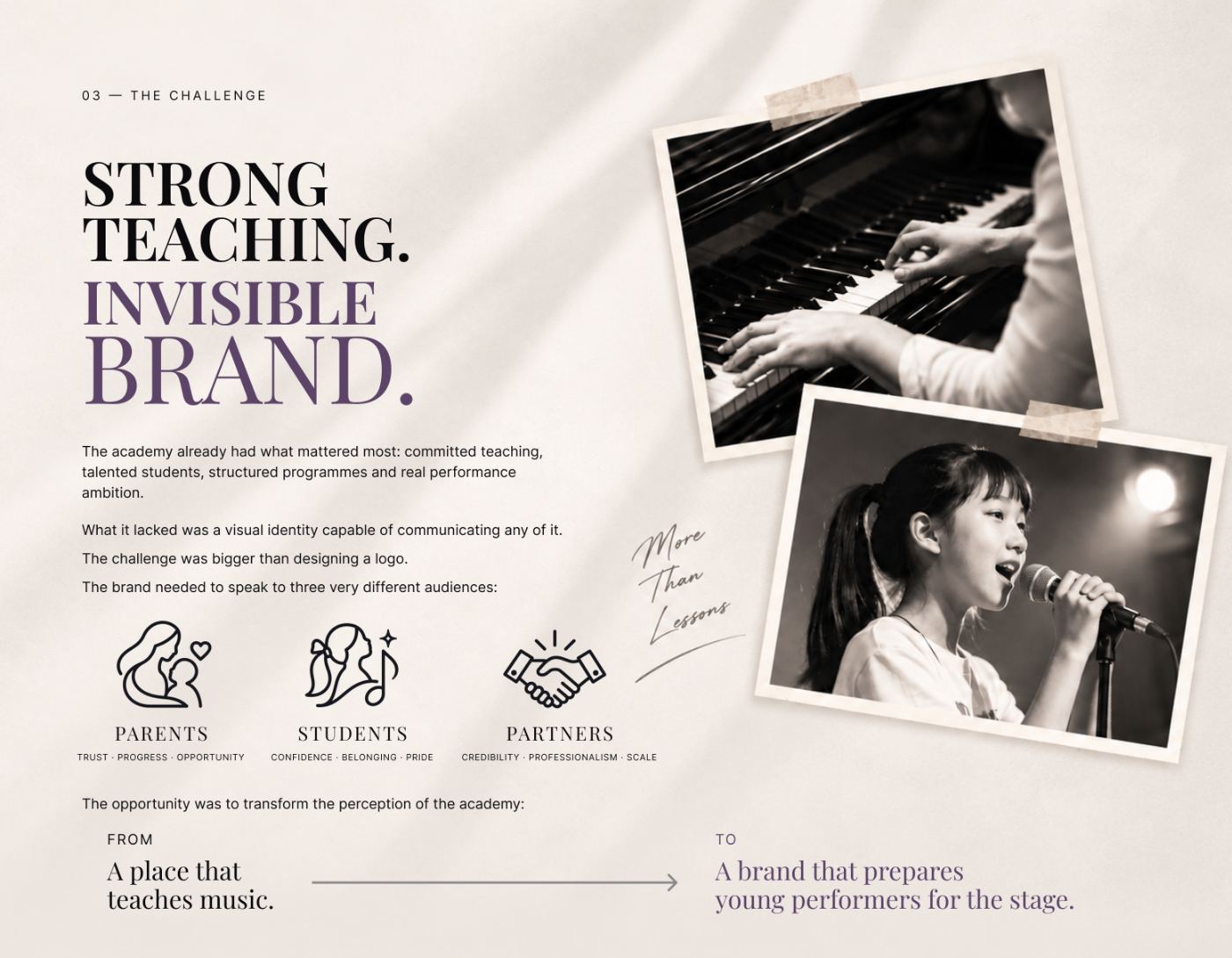
The academy already had what mattered most: committed teaching, talented students, structured programmes and real performance ambition.
What it lacked was a visual identity capable of communicating any of it. The challenge was bigger than designing a logo.
The brand needed to speak to three very different audiences: parents (trust · progress · opportunity), students (confidence · belonging · pride) and partners (credibility · professionalism · scale).
The opportunity was to transform the perception of the academy — from a place that teaches music, to a brand that prepares young performers for the stage.
04 — Strategic positioning
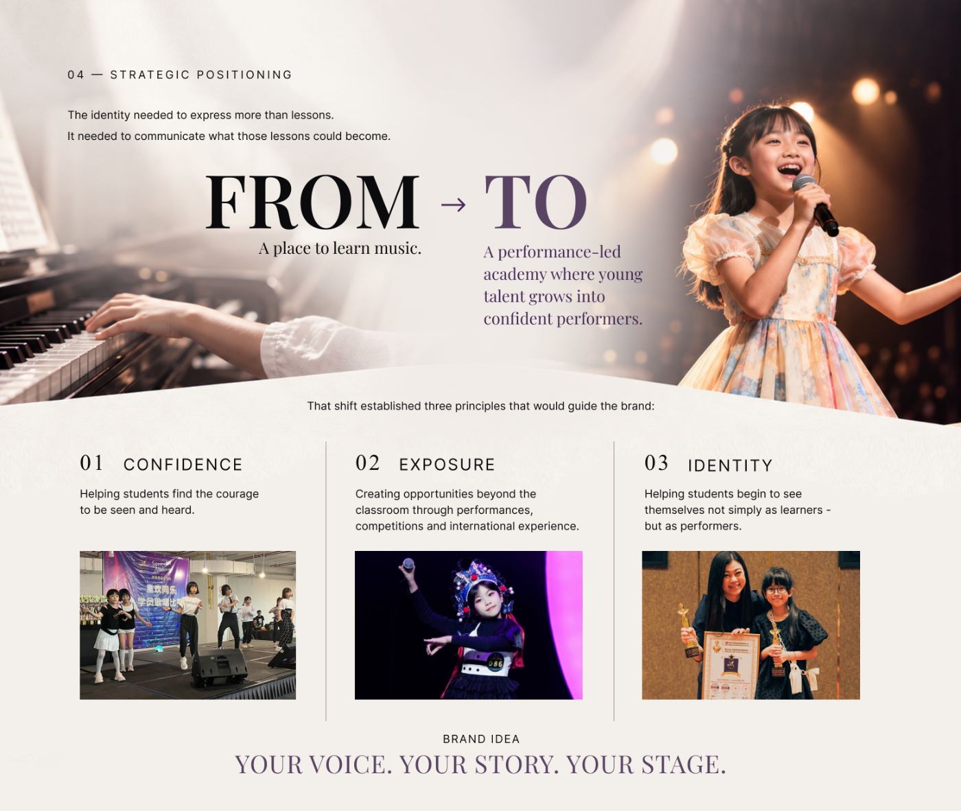
From a place to learn music, to a performance-led academy.
The identity needed to express more than lessons. It needed to communicate what those lessons could become.
From: a place to learn music. To: a performance-led academy where young talent grows into confident performers.
That shift established three principles that would guide the brand. Confidence — helping students find the courage to be seen and heard. Exposure — creating opportunities beyond the classroom through performances, competitions and international experience. Identity — helping students begin to see themselves not simply as learners, but as performers.
Brand idea: Your voice. Your story. Your stage.
05 — The identity
A mark built from meaning.
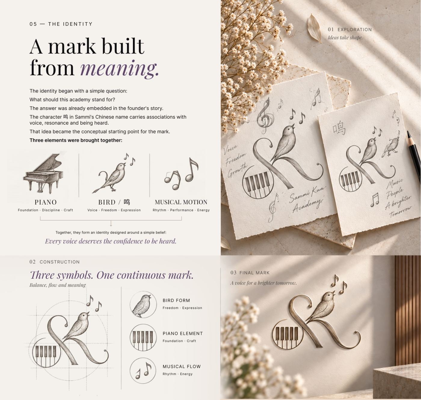
The identity began with a simple question: what should this academy stand for? The answer was already embedded in the founder's story.
The character 鸣 in Sammi's Chinese name carries associations with voice, resonance and being heard. That idea became the conceptual starting point for the mark.
Three elements were brought together: piano (foundation · discipline · craft), bird / 鸣 (voice · freedom · expression) and musical motion (rhythm · performance · energy).
Together, they form an identity designed around a simple belief: every voice deserves the confidence to be heard.
Three symbols. One continuous mark — from exploration, through construction, to the final mark: a voice for a brighter tomorrow.
06 — The visual system
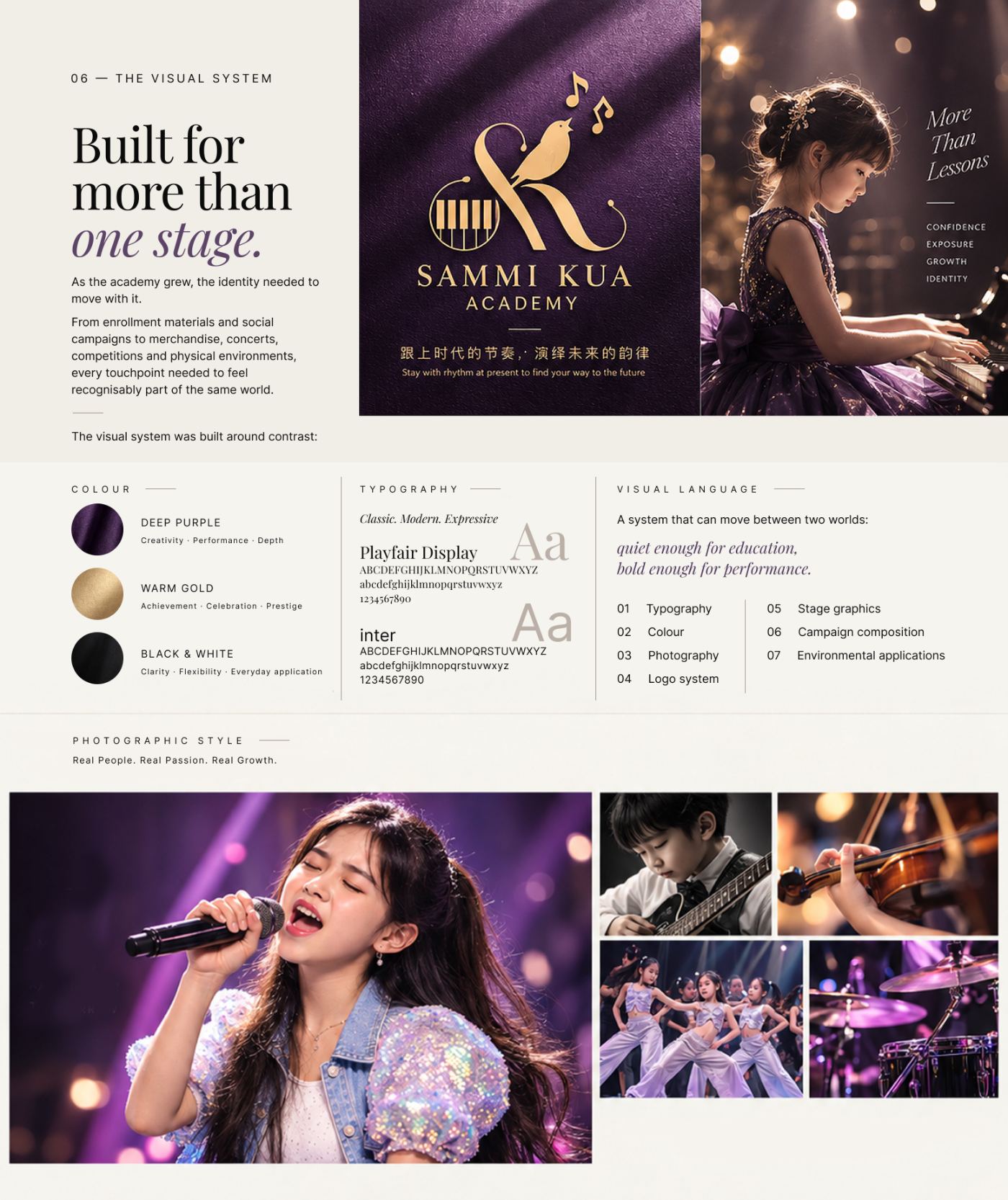
Built for more than one stage.
As the academy grew, the identity needed to move with it.
From enrollment materials and social campaigns to merchandise, concerts, competitions and physical environments, every touchpoint needed to feel recognisably part of the same world.
The visual system was built around contrast. Deep purple for creativity, performance and depth; warm gold for achievement, celebration and prestige; black and white for clarity, flexibility and everyday application. Playfair Display and Inter pair classic with modern.
A system that can move between two worlds: quiet enough for education, bold enough for performance. Photographic style: real people, real passion, real growth.
07 — The brand in the real world
One identity. Many expressions.
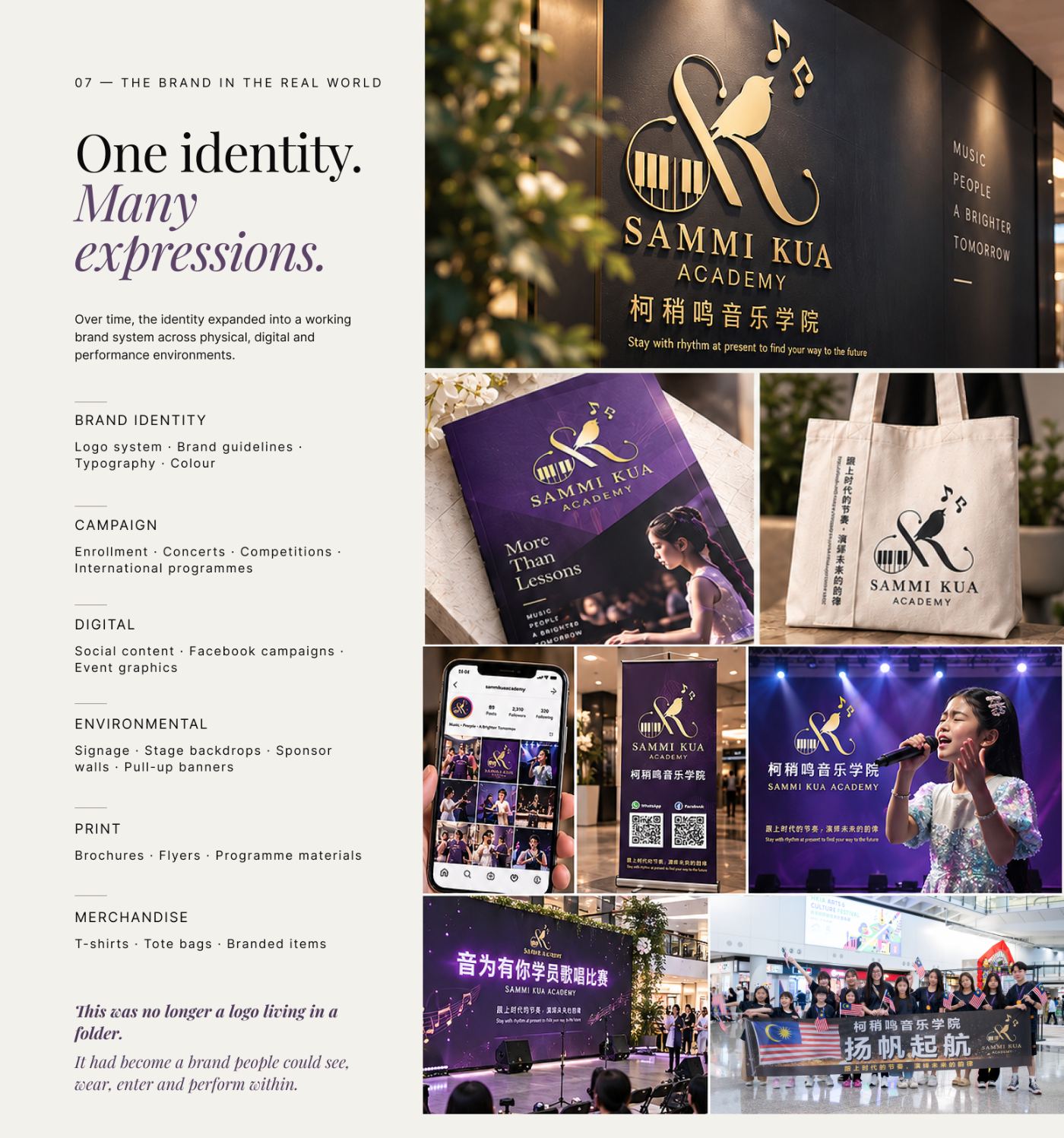
Over time, the identity expanded into a working brand system across physical, digital and performance environments.
Brand identity: logo system, brand guidelines, typography, colour. Campaign: enrollment, concerts, competitions, international programmes. Digital: social content, Facebook campaigns, event graphics. Environmental: signage, stage backdrops, sponsor walls, pull-up banners. Print: brochures, flyers, programme materials. Merchandise: T-shirts, tote bags, branded items.
This was no longer a logo living in a folder. It had become a brand people could see, wear, enter and perform within.
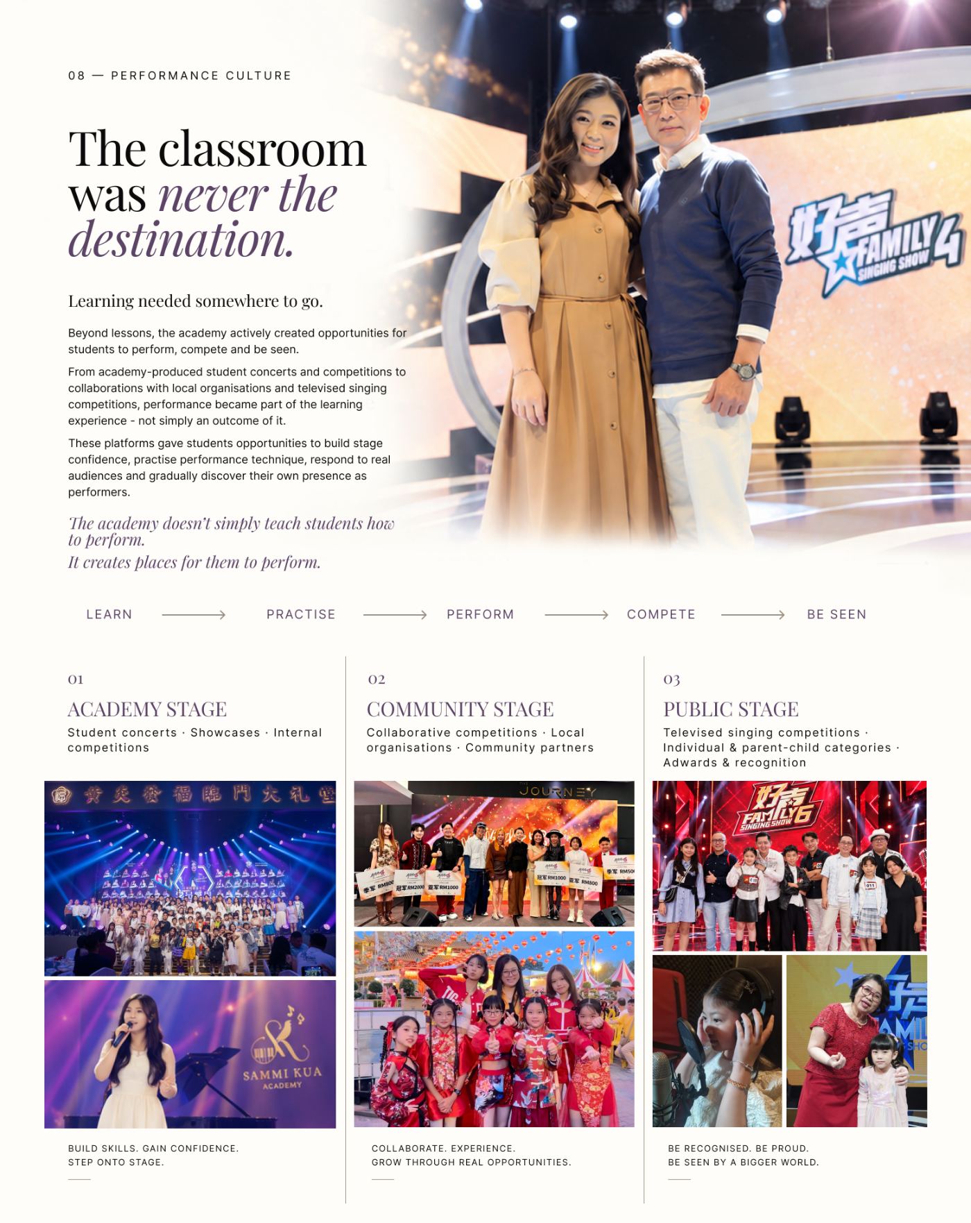
08 — Performance culture
The classroom was never the destination.
Learning needed somewhere to go. Beyond lessons, the academy actively created opportunities for students to perform, compete and be seen.
From academy-produced student concerts and competitions to collaborations with local organisations and televised singing competitions, performance became part of the learning experience — not simply an outcome of it.
These platforms gave students opportunities to build stage confidence, practise performance technique, respond to real audiences and gradually discover their own presence as performers.
Learn → Practise → Perform → Compete → Be seen. Academy stage, community stage and public stage.
The academy doesn’t simply teach students how to perform. It creates places for them to perform.
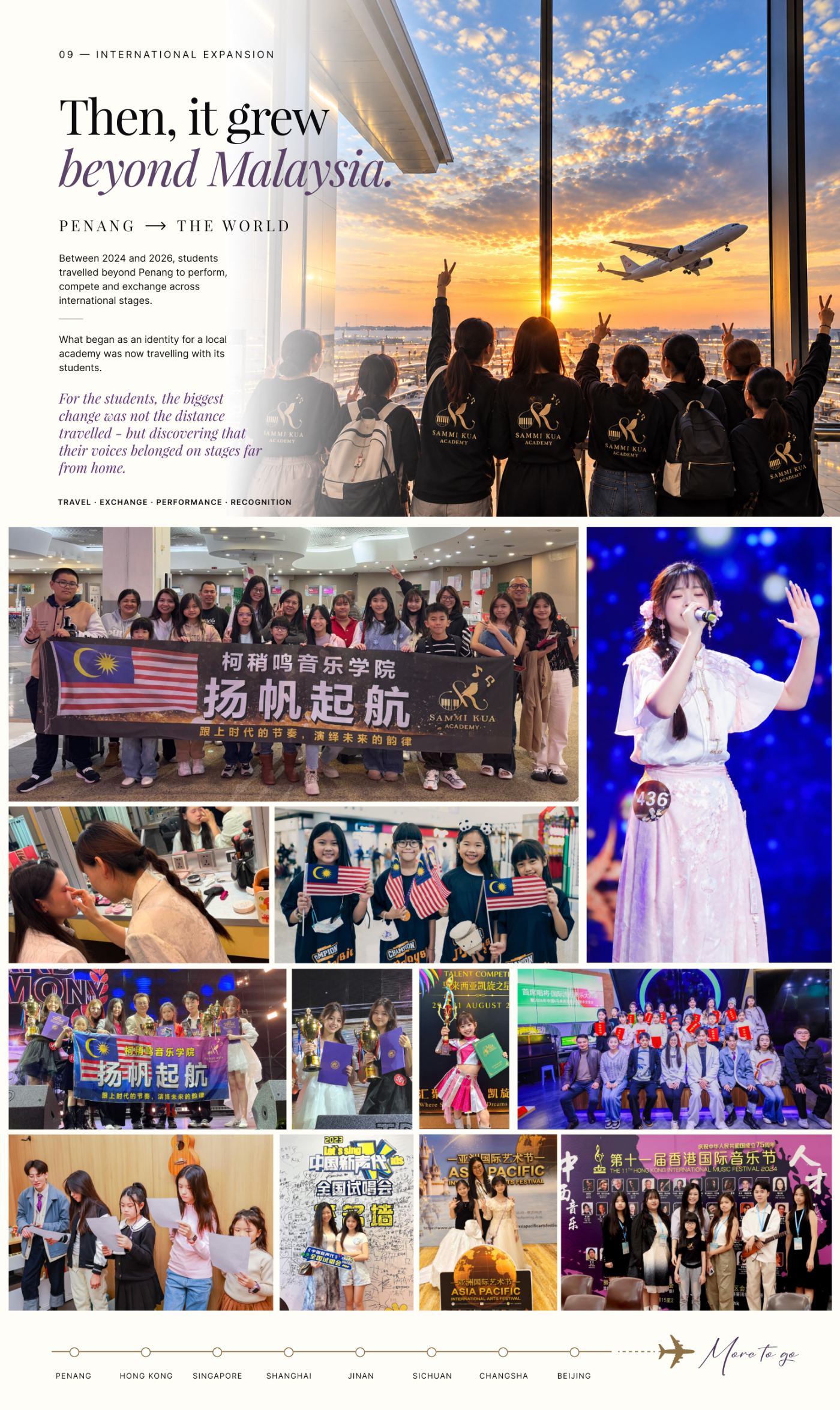
09 — International expansion
Then, it grew beyond Malaysia.
Penang → the world. Between 2024 and 2026, students travelled beyond Penang to perform, compete and exchange across international stages.
What began as an identity for a local academy was now travelling with its students.
For the students, the biggest change was not the distance travelled — but discovering that their voices belonged on stages far from home.
Penang · Hong Kong · Singapore · Shanghai · Jinan · Sichuan · Changsha · Beijing. More to go.
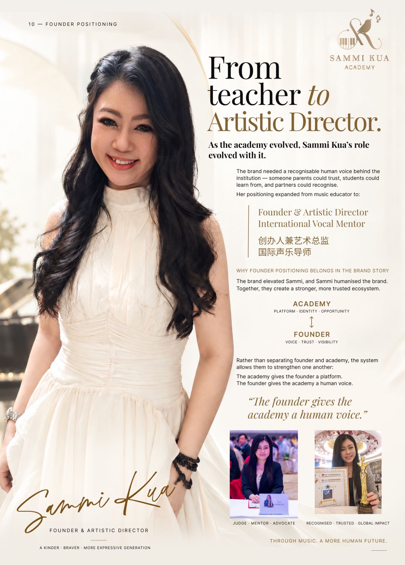
10 — Founder positioning
From teacher to Artistic Director.
As the academy evolved, Sammi Kua’s role evolved with it.
The brand needed a recognisable human voice behind the institution — someone parents could trust, students could learn from, and partners could recognise. Her positioning expanded from music educator to Founder & Artistic Director and International Vocal Mentor.
The brand elevated Sammi, and Sammi humanised the brand. Together, they create a stronger, more trusted ecosystem.
Rather than separating founder and academy, the system allows them to strengthen one another: the academy gives the founder a platform. The founder gives the academy a human voice.
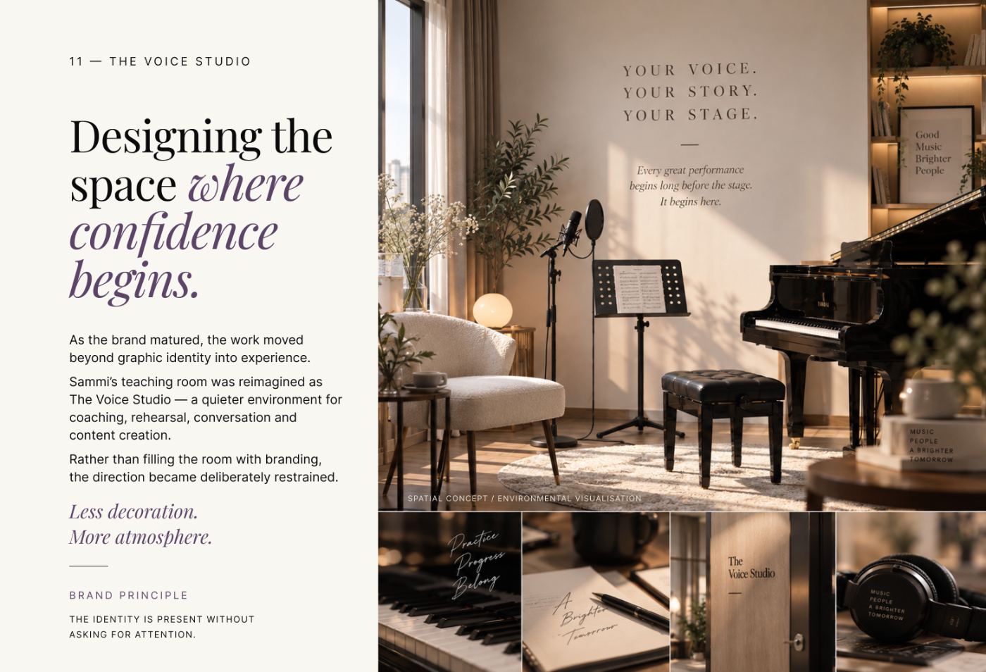
11 — The Voice Studio
Designing the space where confidence begins.
As the brand matured, the work moved beyond graphic identity into experience.
Sammi’s teaching room was reimagined as The Voice Studio — a quieter environment for coaching, rehearsal, conversation and content creation.
Rather than filling the room with branding, the direction became deliberately restrained. Less decoration. More atmosphere.
Brand principle: the identity is present without asking for attention.
12 — Four years. One direction.
A brand built over time.
Most identity projects end when the files are delivered. This one continued to evolve.
Foundation (2022): identity, logo, first campaigns. System (2023): visual language, social, brochure system. Performance (2024): concerts, stage environments, Hong Kong · Singapore · Shanghai. Expansion (2025): international campaigns, Jinan · Sichuan · Changsha · Beijing. Evolution (2026): founder positioning, global-stage direction, ongoing brand development.
What made the project different was not simply its duration. It was the opportunity to design alongside the organisation as it grew.
13 — In the client’s words
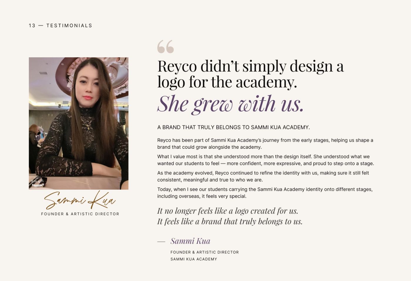
Reyco didn’t simply design a logo for the academy. She grew with us.
A brand that truly belongs to Sammi Kua Academy.
Reyco has been part of Sammi Kua Academy’s journey from the early stages, helping us shape a brand that could grow alongside the academy.
What I value most is that she understood more than the design itself. She understood what we wanted our students to feel — more confident, more expressive, and proud to step onto a stage.
As the academy evolved, Reyco continued to refine the identity with us, making sure it still felt consistent, meaningful and true to who we are.
Today, when I see our students carrying the Sammi Kua Academy identity onto different stages, including overseas, it feels very special.
It no longer feels like a logo created for us. It feels like a brand that truly belongs to us.
— Sammi Kua, Founder & Artistic Director, Sammi Kua Academy

Let’s create something clear and useful.
Whether you’re hiring, collaborating, refreshing a brand or simply curious about my work, I’d be happy to connect.